Click images to enlargeEmpower Students to Take Action
SaaS • Enterprise • UX Design + Research
April 2022
My Role: Senior UX Designer
Company: EAB - Starfish Product
Team: 1 Technical Product Manager, 1 Product Manager, 3 Engineers, 1 QA
Highlighted Outcomes
+40% increase in monthly active student users (MAU)
+18% increase in overall customer satisfaction
Background
Starfish’s case management features help Advisors at higher education institutions identify, track, and engage students with the resources aligned to their specific needs while examining institutional capacity to support students.
One of our fiscal year 2022 business objectives was to increase user engagement and user satisfaction among our student and advisor users. I recommended we tackle a top 3 feature enhancement request, allowing students to manage their tasks assigned by their advisors.
Problems Solved
Empower students to take action with a quick and intuitive experience that increases user engagement from our student and advisor users.
Increase user satisfaction for our advisor users by improving their workflows by distributing the load of managing To-dos with their students in a transparent, holistic, and contextual experience.
Designed to Solve Problems
Student Experience
Call To Action Investigation
We had a few variations for the call to action based on the variety that existed in the product, we didn’t want to reinvent the wheel. I conducted an A/B test to finalize the decision. We prioritized placing a CTA on all possible starting points.
Option 1: Menu Dropdown
Option 2: Button on Card
Post A/B & Usability Tests Findings: Option 2 Chosen
We observed for Option 2: Button on Card, a 30% reduction in average task completion time compared to Option 1.
Student participants visually preferred Option 2: Button on Card because it’s just as “quick as a checkbox and easier to find”.
Task Drawer
As for the heart of the experience, the task drawer. This was a mobile-first design and we honored what students stated as the most helpful during interviews with students:
whether or not the task will require review to understand what’s next.
ability to contact staff regarding the task
not have to wonder what are next steps, if any
Accessibility in the Forefront
During every project, I prioritize an accessible design. With this team, I collaborated with QA Engineers to test for accessibility.
A few accessible design features to highlight:
For validation errors, I added contextual icons & specific help text to assist the user with addressing the issue. I teamed up with engineers to ensure those screen readers were giving our help text the spotlight it deserves!
increased default font size from 12 px to 14 px
added contrast to the font color of the default font
Proposed Accessible Solutions
I also proposed solutions to address accessibility issues found in a previous Accessibility evaluation with the existing experience:
make the labels links instead of the 12px icon per WCAG 2.1
increase the smallest font size to 12px from 10px
Due to the expanded scope, accessibility issues were deprioritized to the product backlog.
Advisors’ Experience
The advisor experience was built on legacy code. With that, when collaborating with the Engineers to nail down an MVP, we agreed that to keep the level of effort low, the advisor experience needed to be limited in innovation but massive in impact!
Additionally, it would frustrate our advisor users if we added complexity to their workflows for managing items. Uninterrupted current workflows result in more engagement and higher retention. So we decided to append the context of a student taking action to what existed with:
A new status labeled Requires Review to help filter items marked complete by a student that required their advisor to review in order to resolve it.
The additional context in areas where advisors send a to-do to make them aware of whether their to-do requires their review vs. no review necessary.


Our Approach
To start, I conducted discovery sessions with 15 advisors and 6 students to validate our initial scope and ensure it meets our users' current needs, building on previous project exploration with the help of account managers and internal stakeholders.
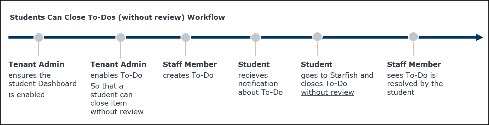
Image Caption
We Learned Advisors & Students Need More Comprehensive Process
Overall, we found that the most value we could provide to advisors and students is a solution to lighten the load of managing to-dos rather than focus solely on resolving the items.
Advisors & Staff users were abandoning to-dos because tracking the progress was time-consuming and tedious. It required staff to manual steps to mark notes of when they’ve followed up with a student to
13 of 15 advisors expressed directly or indirectly that they need a review process for to-dos a student had marked done. Stating that they’re far more concerned about to-dos that require reviewing completion such as academic probation requirements vs. having the student only mark the tasks as done.
Students needed something quick & easy; "just want to check it off & go."
The most painful point was the slow feedback loop. Students had to reach out to an advisor & wait until they marked the item complete.
5 of 6 students stated, "To-dos are easy to miss, and I never log in because there are not many actions I can take" on the platform.
Present Findings to Propose Scope Expansion
The initial project scope was adding an interaction for students to mark items as done, neglecting support for advisors. We got some initial senior leadership push-back, Grace Maddock (PM) and I presented data to advocate for a scope expansion to include a review process to support advisors. Additionally, we collaborated with the engineering team to estimate LOE(Level of Effort) and trimmed features for a lean MVP (minimum viable product).
After some discussion, scope expansion was approved and we chose to have two releases. In the first release, students can resolve tasks. Followed by students can request a review, and then advisors may resolve tasks per review.
Outcomes
I facilitated usability tests and feedback surveys throughout the design process to validate iterations quickly. We used Gainsight to send out a survey during discovery for a baseline of the existing experience, followed by another survey months post-feature adoption.
Overall Customer Retention
99% retention increased from 92%
Student User Engagement
40% Increase in Student Monthly Active Users (MAU)
Student User Satisfaction
12% Increase in Student satisfaction, rose to 88% from 76%
Advisor User Satisfaction
6% Increase in advisors satisfaction, rose to 96% up from 90%
Let's round 'em up and lasso success together!
📨 chelseahunt.ux@gmail.com
📍 Houston, TX
👩🏽💻 Will Work Worldwide.
Download My Resumé (Opens New Tab)
Sed purus sem, scelerisque ac rhoncus eget, porttitor nec odio. Lorem ipsum dolor sit amet.